
3 Python Visualization Libraries You MUST Know as A Data Scientist
In real life, data preprocessing is really a pain for most data scientists. But with the help of data visualization libraries, it actually can be fun to play with.

Me, for example, frequently dealing with data in the medical industry, usually facing dataset that is sparse, miss-labeled and legacy(oops). A great visualization technique can quickly give you a deep insight into the data, sometimes even before training, or making a better representation of existing model explanation and extraction.
As the title suggests, we are gonna quickly CODE through the three most exciting visualization libraries in Python, and help you look through the disguise of your poor data.
Overview:
- Matplotlib: Low-level detailed dev tool, freedom of coding
- Seaborn: “statistical data visualization”, based on Matplotlib
- Missingno: a small handy lightweight tool for NaN representation
Env Setup:
We are taking advantage of the power of Pandas and Numpy. If you do not have those tools in your hand, simply click the link above and follow those instructions. I personally recommend installing using Anaconda for both dependencies, type following commands in Anaconda Prompt and you are done!
conda install -c anaconda pandas
conda install -c anaconda numpy
Then, set up for our five visualization libraries:
Matplotlib:
conda install -c conda-forge matplotlib
Seaborn:
conda install -c anaconda seaborn
Missingno:
conda install -c conda-forge missingno
Now, you are all set!
Data Setup:
I am using the data from Kaggle open dataset, and setup in Colab. I won’t bore you with the detail about the API calls and setup stuff, if you need help, you can DM me and I can walk you through it! Theses docs may help if you really want to work in the Colab, and I am sharing my workspace here as well.
# !pip install kaggle
%mkdir -p /content/playground/data/
%cd /content/playground/data/
!kaggle competitions download -c home-data-for-ml-course
!pip install quilt
!quilt install ResidentMario/missingno_data
This script is used in Colab, make a workspace on your local env, fetch data from Kaggle, then install missingno. The data we are using is Kaggle “Housing Prices Competition for Kaggle Learn Users”, which is a well documented open-source dataset.
import numpy as np
import pandas as pd
import missingno as msno
import seaborn as sns
import matplotlib.pyplot as plt
import missingno as msno
train=pd.read_csv("train.csv")
train.head()
Now, we import all dependencies, read the data, and glimpse at the first few lines of this dataset
| FIELD1 | Id | MSSubClass | MSZoning | LotFrontage | LotArea | Street | Alley | LotShape | LandContour | Utilities | LotConfig | LandSlope | Neighborhood | Condition1 | Condition2 | BldgType | HouseStyle | OverallQual | OverallCond | YearBuilt | YearRemodAdd | RoofStyle | RoofMatl | Exterior1st | Exterior2nd | MasVnrType | MasVnrArea | ExterQual | ExterCond | Foundation | BsmtQual | BsmtCond | BsmtExposure | BsmtFinType1 | BsmtFinSF1 | BsmtFinType2 | BsmtFinSF2 | BsmtUnfSF | TotalBsmtSF | Heating | … | CentralAir | Electrical | 1stFlrSF | 2ndFlrSF | LowQualFinSF | GrLivArea | BsmtFullBath | BsmtHalfBath | FullBath | HalfBath | BedroomAbvGr | KitchenAbvGr | KitchenQual | TotRmsAbvGrd | Functional | Fireplaces | FireplaceQu | GarageType | GarageYrBlt | GarageFinish | GarageCars | GarageArea | GarageQual | GarageCond | PavedDrive | WoodDeckSF | OpenPorchSF | EnclosedPorch | 3SsnPorch | ScreenPorch | PoolArea | PoolQC | Fence | MiscFeature | MiscVal | MoSold | YrSold | SaleType | SaleCondition | SalePrice |
|---|---|---|---|---|---|---|---|---|---|---|---|---|---|---|---|---|---|---|---|---|---|---|---|---|---|---|---|---|---|---|---|---|---|---|---|---|---|---|---|---|---|---|---|---|---|---|---|---|---|---|---|---|---|---|---|---|---|---|---|---|---|---|---|---|---|---|---|---|---|---|---|---|---|---|---|---|---|---|---|---|---|
| 0 | 1 | 60 | RL | 65.0 | 8450 | Pave | NaN | Reg | Lvl | AllPub | Inside | Gtl | CollgCr | Norm | Norm | 1Fam | 2Story | 7 | 5 | 2003 | 2003 | Gable | CompShg | VinylSd | VinylSd | BrkFace | 196.0 | Gd | TA | PConc | Gd | TA | No | GLQ | 706 | Unf | 0 | 150 | 856 | GasA | … | Y | SBrkr | 856 | 854 | 0 | 1710 | 1 | 0 | 2 | 1 | 3 | 1 | Gd | 8 | Typ | 0 | NaN | Attchd | 2003.0 | RFn | 2 | 548 | TA | TA | Y | 0 | 61 | 0 | 0 | 0 | 0 | NaN | NaN | NaN | 0 | 2 | 2008 | WD | Normal | 208500 |
| 1 | 2 | 20 | RL | 80.0 | 9600 | Pave | NaN | Reg | Lvl | AllPub | FR2 | Gtl | Veenker | Feedr | Norm | 1Fam | 1Story | 6 | 8 | 1976 | 1976 | Gable | CompShg | MetalSd | MetalSd | None | 0.0 | TA | TA | CBlock | Gd | TA | Gd | ALQ | 978 | Unf | 0 | 284 | 1262 | GasA | … | Y | SBrkr | 1262 | 0 | 0 | 1262 | 0 | 1 | 2 | 0 | 3 | 1 | TA | 6 | Typ | 1 | TA | Attchd | 1976.0 | RFn | 2 | 460 | TA | TA | Y | 298 | 0 | 0 | 0 | 0 | 0 | NaN | NaN | NaN | 0 | 5 | 2007 | WD | Normal | 181500 |
| 2 | 3 | 60 | RL | 68.0 | 11250 | Pave | NaN | IR1 | Lvl | AllPub | Inside | Gtl | CollgCr | Norm | Norm | 1Fam | 2Story | 7 | 5 | 2001 | 2002 | Gable | CompShg | VinylSd | VinylSd | BrkFace | 162.0 | Gd | TA | PConc | Gd | TA | Mn | GLQ | 486 | Unf | 0 | 434 | 920 | GasA | … | Y | SBrkr | 920 | 866 | 0 | 1786 | 1 | 0 | 2 | 1 | 3 | 1 | Gd | 6 | Typ | 1 | TA | Attchd | 2001.0 | RFn | 2 | 608 | TA | TA | Y | 0 | 42 | 0 | 0 | 0 | 0 | NaN | NaN | NaN | 0 | 9 | 2008 | WD | Normal | 223500 |
| 3 | 4 | 70 | RL | 60.0 | 9550 | Pave | NaN | IR1 | Lvl | AllPub | Corner | Gtl | Crawfor | Norm | Norm | 1Fam | 2Story | 7 | 5 | 1915 | 1970 | Gable | CompShg | Wd Sdng | Wd Shng | None | 0.0 | TA | TA | BrkTil | TA | Gd | No | ALQ | 216 | Unf | 0 | 540 | 756 | GasA | … | Y | SBrkr | 961 | 756 | 0 | 1717 | 1 | 0 | 1 | 0 | 3 | 1 | Gd | 7 | Typ | 1 | Gd | Detchd | 1998.0 | Unf | 3 | 642 | TA | TA | Y | 0 | 35 | 272 | 0 | 0 | 0 | NaN | NaN | NaN | 0 | 2 | 2006 | WD | Abnorml | 140000 |
| 4 | 5 | 60 | RL | 84.0 | 14260 | Pave | NaN | IR1 | Lvl | AllPub | FR2 | Gtl | NoRidge | Norm | Norm | 1Fam | 2Story | 8 | 5 | 2000 | 2000 | Gable | CompShg | VinylSd | VinylSd | BrkFace | 350.0 | Gd | TA | PConc | Gd | TA | Av | GLQ | 655 | Unf | 0 | 490 | 1145 | GasA | … | Y | SBrkr | 1145 | 1053 | 0 | 2198 | 1 | 0 | 2 | 1 | 4 | 1 | Gd | 9 | Typ | 1 | TA | Attchd | 2000.0 | RFn | 3 | 836 | TA | TA | Y | 192 | 84 | 0 | 0 | 0 | 0 | NaN | NaN | NaN | 0 | 12 | 2008 | WD | Normal | 250000 |
Then, we only use a subset of the whole dataset for the purpose of demonstration
col_sel = ["Alley", "Street", "LotArea", "LotFrontage", "Utilities", "LandSlope", "Neighborhood", "YearBuilt", "YearRemodAdd"]
subTrain = train[col_sel]
subTrain.head()
| FIELD1 | Alley | Street | LotArea | LotFrontage | Utilities | LandSlope | Neighborhood | YearBuilt | YearRemodAdd |
|---|---|---|---|---|---|---|---|---|---|
| 0 | NaN | Pave | 8450 | 65.0 | AllPub | Gtl | CollgCr | 2003 | 2003 |
| 1 | NaN | Pave | 9600 | 80.0 | AllPub | Gtl | Veenker | 1976 | 1976 |
| 2 | NaN | Pave | 11250 | 68.0 | AllPub | Gtl | CollgCr | 2001 | 2002 |
| 3 | NaN | Pave | 9550 | 60.0 | AllPub | Gtl | Crawfor | 1915 | 1970 |
| 4 | NaN | Pave | 14260 | 84.0 | AllPub | Gtl | NoRidge | 2000 | 2000 |
Seaborn & Matplotlib
As we mentioned above, Matplotlib is a low-level plot tool that supports all plot functionalities. We usually combine the power of Seaborn and Matplotlib to get better representation. Some frequently used graphs in Seaborn:
We normally using heatmap for correlation plot between features, while it can also be used to plot the relationship between any three features in 3D contour plot(at least one have to be number field)
f,ax = plt.subplots(figsize=(8,8))
sns.heatmap(subTrain.corr(),annot=True, fmt=".2f",ax=ax)
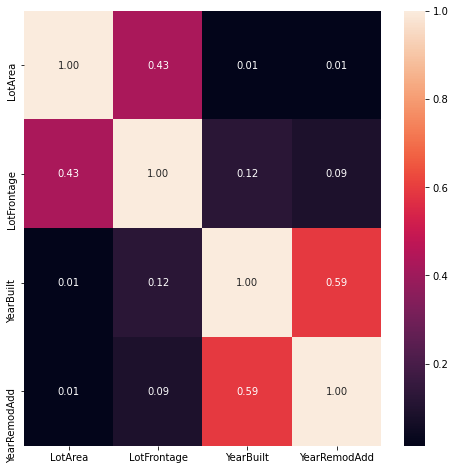
Only data with dtype!=string will have a correlation calculated. We see a high correlation between variable YearBuild and YearRemodAdd
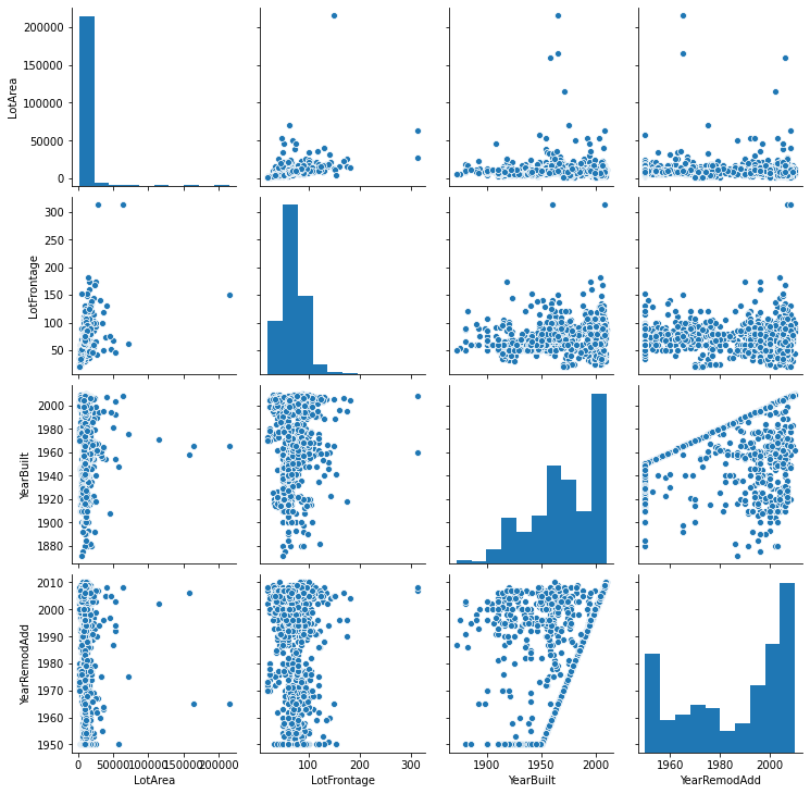
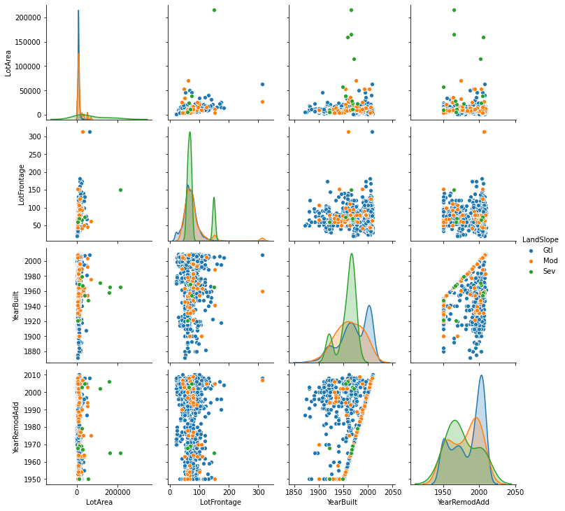
- Pair Plot
pairplot is also a very handy tool for data summary. You can not only see the pairwise relation between features but also univariate plot, probability mass plot, etc.
g = sns.pairplot(subTrain)
g2 = sns.pairplot(subTrain, hue="LandSlope")
- Violin Plot
violinplotis generally used for distribution visualization and distribution comparison. For features differs in another feature with only two unique entries, we usesplit=Trueto compare between themscale = 1.5 plt.figure(figsize=(len(col_sel)*scale, len(col_sel)*scale)) sns.violinplot(x="LandSlope", y="LotArea", hue="Street", split=True, palette="Set2",data=subTrain, inner="stick",scale="count") plt.xticks(rotation=90);
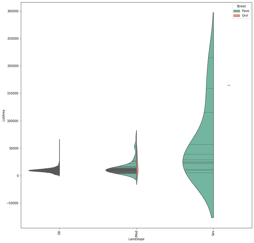
As shown in graph, we see LandSlope and LotArea only affected by Street , which only has two types of entry: Pave and Grvl. The plate variable select color theme for this plot and inner=”stick” corresponding to each dataset entry
missingno & Matplotlib
Missingno is a small but fancy library for data visualization. It has regular charts such as heatmap, Bar Chart like Seaborn does but also has some unique charts such as the null Matrix chart and Dendrogram.
In Medical Science data, there will frequently have a lot of null data, the missingno come in very straightforward in null space representation, cannot be more recommended!
%matplotlib inline
msno.matrix(subTrain, figsize=(15, 15), color=(0.24, 0.77, 0.77))

The missingno represent data with horizontal sticks, the absence of a stick in place shows a null value. We see the feature Alley very sparse, and the feature LotFrontAge has a fair amount of useful data. Therefore, for data preprocessing, we can decide to drop Alley and impute LotFrontage
Next Step and Beyond:
Those three libraries are very basic but extremely powerful in the Data Science area and are enough of 95% of data visualization jobs in the industry. Some next-level tools such as Plotly or Bokeh, also build upon Matplotplib, get you the power of building interactive plots and serves on Web applications. I will get into that area when I learn more about Python Backend techniques and Frontend engineering 👊